Goodbye. Zillow sold their last house in Sacramento. After announcing failure as an iBuyer in late 2021, they recently got rid of their final unit. And the cherry on top is they sold this property to Opendoor.

UPCOMING (PUBLIC) SPEAKING GIGS:
10/18/22 Orangevale MLS Meeting Q&A (9am)
10/20/22 How to Think Like an Appraiser (9am-12pm) (Sign up here)
11/15/22 Sacramento Bee Q&A at 12pm (RSVP here)
11/17/22 DEI & Fair Housing Lunch & Learn (details TBD)
1/18/23 WCR Market Update in Cameron Park (details TBD)
HOUSING GENIUS OR FLOP?
It’s easy to look at Zillow like some sort of real estate savant because their exit was announced months before the hot housing market began to turn. But let’s not revise history because Zillow’s failure had nothing to do with market conditions. This was about a lack of effective strategy. Zillow basically went on a purchasing rampage in a handful of markets across the country, and they lost a ton of money. I wrote about their failure here. In short, with hindsight their timing looks really good, but this was a flop instead of foresight in terms of actually making money.
Anyway, I announced the news of their last sale about two weeks ago on my socials, and it created a ton of conversation.

ZILLOW’S LAST HOME IN SACRAMENTO
In September 2022 Zillow sold their last unit to Opendoor. This home in the Natomas area of Sacramento was originally purchased for $700,500 in November 2021, and it was listed for sale in February 2022 for $694,100. There were multiple price reductions until the listing was eventually cancelled on 9/13/2022 at $624,900. There were two pending statuses, but for whatever reason it didn’t close.
DID ZILLOW GIVE OPENDOOR A DISCOUNT?
You be the judge. The sale to Opendoor at $354,500 was far lower than literally any competitive sale on MLS (blue dots), and much lower than any model match sale (red dots). A model match sale hasn’t sold this low since before 2016. When looking at this visual, do you think there was a reduced price?

ZILLOW SOLD LOWER THAN ANYTHING IN THE NEIGHBORHOOD
Here’s a different way to look at it. The orange dots represent every MLS sale in the neighborhood, and the off-market price to Opendoor was lower than literally all neighborhood sales (of any size). Also, Opendoor typically gets about a 5% credit from the seller, and if that’s what happened here, Opendoor got an even better deal.

THE VERDICT: YES, THEY SOLD AT A DISCOUNT
Unless there was something that went seriously wrong with the condition of this property within the two-week period of this home being pulled from the market and sold to Opendoor, it’s pretty obvious this unit sold at a discount. Why did Zillow sell it so low when buyers would have been lining up at that price? Will Zillow get a better tax write-off for their loss? Or does this have anything to do with Zillow and Opendoor recently establishing a multi-year partnership? Does this benefit Opendoor’s profit on paper so they can show higher numbers from buying low and selling high?
NOTE: I’ll follow up when this house does sell again.
iBUYERS RIGHT NOW
I’ve noticed Opendoor has seemed to slow their acquisitions lately in response to the market changing so quickly. This makes sense as a way to pause and pivot in a different market. Locally, Opendoor is the largest iBuyer as they have about 280 units, while OfferPad only has 11, and Redfin owns 24. Opendoor normally has about 330 homes in the region, but now it’s closer to 280, which is why I’m saying they’ve been slowing their acquisitions. Opendoor was struggling in Sacramento when I wrote about them in August, but they’ve seemed to get more of their units into contract in recent months. I’m not sure if it was strategic price reductions or the $3,500 incentive they offered (maybe both). Still, only 25.6% of everything Opendoor has listed for sale is pending, so most of their stuff is sitting instead of selling. Ultimately, if we continue to see prices drop it’ll be key for iBuyers and any flippers to acquire properties for lower amounts to anticipate future declines. I’ve said all along there is room in real estate for multiple models to exist, but no matter what the model, the numbers need to work to make profit. Anyway, iBuyers are still here, and they’re trying to pivot. Will they be successful? Only time will tell.
UPDATE (NEW STATS): I pushed out Redfin iBuyer stats on Twitter yesterday to help show how much lower most of their listings are compared to the acquisition price. This sums up the dynamic out there right now with iBuyers.
Thanks for being here.
MARKET STATS: I’ll have lots of market stats out this week on my social channels, so watch Twitter, Instagram, LinkedIn, and Facebook.
Questions: What stands out to you most above? How does Zillow selling to Opendoor sit with you? I’d love to hear your take.
If you liked this post, subscribe by email (or RSS). Thanks for being here.

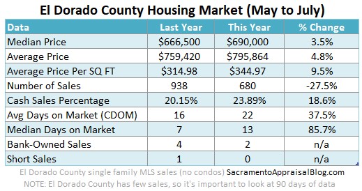
 Here are some quick thoughts about the latest stats. There is so much to talk about.
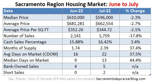