Let’s talk about two things today. The myth of six months of inventory being normal and dipping prices. I’d love to hear your take in the comments.

UPCOMING (PUBLIC) SPEAKING GIGS:
8/25/22 State of Housing Brunch & Learn (sign up (for real estate community))
9/08/22 SAFE CU “Stats & Mimosas” (sign up (for real estate community))
9/15/22 Market update in Midtown (details TBD)
IS SIX MONTHS OF SUPPLY NORMAL?
Here’s how the conversation goes lately. “Bro, don’t worry about having two months of supply right now because we’re so far from a normal market of five to six months of inventory.” Have you heard that? I’ve seen it a gazillion times on Facebook and Instagram. But here’s the deal. There is NO such thing as a normal six-month supply level that applies in every local market.
LOCATION REALLY MATTERS:
This is one of my favorite visuals from John Burns Real Estate Consulting, and I got it from Rick Palacios Jr.. Check out the red bars, which signify the months of supply needed to see price declines in various areas. Do you see how prices would decline in Orlando with about a six-month supply of homes? And Las Vegas would drop closer to three months, right? But check out Charlotte because it can apparently handle one year or more of supply. In Sacramento, the market is said to have healthy price appreciation under 1.5 months, mixed results between 1.6 to 3.2 months, and price depreciation above 3.3 months.

MY TAKE ON THE GRAPH:
I can’t speak for every market here, so I’d love to hear if this lines up with your area. All I know is this visual is more or less in sync with local trends. In short, any time we’ve been too much above three months of supply over the past two decades in Sacramento County (or more or less in the region), we’ve been in a declining market. The trend got really soft also in 2014 and 2018 as we hovered between 2.5 to 3.0 months. Right now, we have 2.14 months of supply in Sacramento County and 2.38 months in the region, and this level is basically in “normal” territory for recent history. For those that say five to six months is the norm in Sacramento, can you imagine doubling inventory? Do you think prices would still be stable? I don’t think so.
UPDATED COMMENTARY ON 9/28/2022:
I wanted to clarify something. The visual above is on point statistically, and I agree with it based on the history of trends. But keep in mind we don’t need to get up to three months of supply to see prices decline. In other words, don’t be rigid or dogmatic about these visuals. We’ve already been seeing a major change in the market despite still having lower supply. Even the image itself says “mixed results” when above 1.6 months. My advice? Believe that.
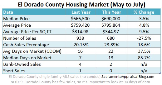
An important asterisk: Some local counties are okay above three months, so please don’t be dogmatic here. For instance, El Dorado County historically hovers between 3.0 to 3.5 months with no problems.

WHY THIS MATTERS (THIS IS NOT A RANT):
I realize my post sounds super petty, but it’s not a rant, and I’m not trying to micromanage what anyone says. Think about it this way. If the real estate community develops a narrative and professional advice based on housing supply being normal at six months, could that lead to some bad local advice or flawed perspective? Yep, I think so.
QUICK CLOSING NUGGETS:
Let’s remember inventory isn’t the same in every ZIP code and price range. Some locations and price points are going to run higher or lower as a normal trend. For instance, El Dorado County and Placer County both tend to have a higher housing supply than Sacramento County. Or the million-dollar market historically has more than five to seven months of inventory easily, but that level of supply for the entire market would be disastrous.
I hope this was helpful. Thanks for being here.
Any thoughts?
—–——– DEEP MARKET UPDATE (PRICES AND VOLUME) ———––
 Here are some quick thoughts about home prices and stats for July / August so far. There is so much to talk about.
Scroll quickly or digest slowly.
SHARING POLICY: I welcome you to share some of these images on your social channels or in a newsletter. In case it helps, here are 6 ways to share my content (not copy verbatim). Thanks.
Let’s look at price trends, but volume first…
DROPPING PENDING VOLUME & SALES VOLUME:
There are many metrics to watch, but dropping pending volume and dropping sales volume is huge right now because it speaks to a massive shift in demand in recent months. In the Sacramento region we saw about 24% fewer pending contracts last month based on Trendgraphix data (and about 30% fewer closed sales). For perspective, there have been about 2,250 fewer closed sales from April through early August in the Sacramento region. This is basically like an entire month of sales not happening this year.
Sharp change won’t show up every month: Keep in mind the sharp drop we’ve seen in recent months won’t continue at the same pace every month. Case-in-point. Pending volume was down about 30% in June and 24% in July (per Trendgraphix). We’ll see where it goes in August once the month is over. I’m just saying we saw a sharp change between May and June, and that sort of intense change isn’t going to be present every single month.
Fewer new listings: We’ve actually been seeing fewer new listings hitting the market over the past couple of months, and it’s possible that dynamic can slow the pace of sharp change too. I’ve observed slightly more multiple offers in recent weeks among pendings, but I’m not writing home over that yet. In short, it’s to be determined what the black line does, so let’s keep watching.


PRICE REDUCTIONS:
About half of all active listings have had a price reduction in the Sacramento region. Here are stats as of two days ago.

WHAT ARE PRICES DOING?
First off, I’m less interested in prices because it’s the last place the trend shows up (I wrote about that here). With that said, prices are dipping right now. This is what normally happens for the season, so it’s not unexpected to see price declines at this time of year. Yet, today we are seeing slightly more pronounced seasonal declines as shown in the images below. Keep in mind the temperature isn’t exactly the same in every single price range and neighborhood either (so save your hate mail). I’m talking about the market as a whole.
Ch-ch-ch-change: We’re living in the midst of change, and we are still toward the beginning of a market that shifted away from the most aggressive two-year stint we’ve seen. It’s like we were on an extended luxury honeymoon and now we’re back home trying to figure out what life looks like. In short, let’s keep watching prices by the week and month to understand what is happening seasonally as well as the bigger picture (up or down market cycle). But like I alluded to above, we have to be careful about focusing too much on prices. In my mind, the bigger issue in today’s market is the homes that aren’t selling rather than the price of homes that are selling. Know what I’m saying?
PRICE GROWTH IS SLOWING:
Instead of being up 15-20% from last year, we’re starting to see stats closer to 6% or so (though each county is different). In a normal year we should see a slight dip for the next couple of months and then a bit of a flat median price trend. Let’s keep watching to see what happens. But there is a little bump sometimes in the fall too as buyers tend to have one last rush on the market before the holidays, so be on the lookout.

PRICES BETWEEN JUNE & JULY:
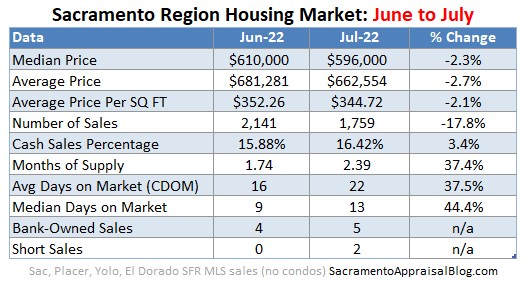
Here’s some context to help show what normally happens between June and July each year to the median price. Look, the market isn’t always exactly the same between these two months, which is why we want to take a wide view to interpret change today. Basically, the percentage difference today is technically about the same as last year, so be careful about sensationalism based on these stats. However, over the past few months we’ve seen change that is more pronounced (see a few images below).


Some sellers are trying to use Jedi mind tricks instead of proper pricing.

New visuals: I’m still figuring out if I like these next two new visuals, but I’m experimenting to show what price growth looks like throughout the year. These images help show what the median price does from month to month. For instance, the most recent portion of the black line below shows the median price change at -2.3% in July. This percentage represents the change between June and July this year, and it’s clear this is on the lower side of normal (or like I said above, a more pronounced price decline).

Price rhythm: What normally happens to prices during the year? Well, the red line below goes up during the beginning of the year, dips, and then rebounds slightly toward the end of the year. I’ll be adding to this visual as the year unfolds so we can get a sense of price changes today. If you have better ideas for visualizing the market too, I’m open ears.

YEAR OVER YEAR STATS:
Annual stats are important to digest, but don’t forget to look at month to month stats. And remember, closed sales in July really tell us what the market used to be like in June when the bulk of these properties got into contract. Also, not every location and price range have the same trend (big point).


MONTH TO MONTH:
Looking at sequential months is key too so we don’t just get stuck or hyper-focused on last year (the past).


OTHER VISUALS:
Here are lots of visuals. Probably more than you wanted. Enjoy if you wish though, and let me know what you like best.


MARKET STATS: I’ll have lots of market stats out this week on my social channels, so watch Twitter, Instagram, LinkedIn, and Facebook.
Thanks for being here.
SHARING POLICY: I welcome you to share some of these images on your social channels or in a newsletter. In case it helps, here are 6 ways to share my content (not copy verbatim). Thanks.
Questions: What do you think about six months of supply being normal? What are you seeing out there in the market? I’d love to hear your take.
If you liked this post, subscribe by email (or RSS). Thanks for being here.