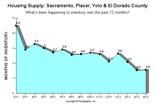
I don’t read calculus books for kicks, but I do like numbers. It’s really interesting to watch the trends in our real estate market in Sacramento to consider where we’ve been, what is happening now and where we might go. Take a minute to check out these graphs below and let me know what you think. What do you see?

Not many houses for sale: We’ve seen a huge drop in housing supply in the Sacramento area. Check out the graph above of Sacramento, Placer, Yolo and El Dorado Counties. Source: Trendgraphix, Inc.

Sacramento vs. Placer County: It’s interesting to see Placer County and Sacramento County median sales prices juxtaposed. I’m particularly interested to see how the trend evolves in the next six months. There is a slight uptick evidenced as of late and the Sacramento Association of Realtors blog reported an increase in median sales price level in April also. Only time will tell to see how that further unfolds. This graph comes from Joel Wright of Wright Real Estate (used with permission).

The Unemployment Saga: How is unemployment doing in the Sacramento area? Here is a historical glimpse of unemployment in Sacramento County from January 1990 through March 2012. I keep a running graph each month like this. If you need a larger size for a presentation or your blog, let me know (just keep my blog URL in the graph and see my sharing policy). Data source: EDD.

Current Unemployment Trends: As of March 2012 the unemployment rate per EDD in Sacramento County is 11.4%, which is similar to the rate during June 2009. It’s been so nice to see a decline from the high of 13.2% in July 2010, but there has been a slight uptick lately as you can see above. Unemployment rates tend to fluctuate, so it’s understandable to see the rate experience a little increase during recent months, but we just need it to decline to see housing improve. Bottom line.

California vs. Sacramento: How does the Sacramento area stack up against price trends in the rest of California? This graph shows the median price in California compared to the Sacramento area. The graph comes from Joel Wright of Wright Real Estate (used with permission).

Distressed vs. Traditional Sales: The Calculated Risk blog has some pretty amazing content. Be careful when you visit though because you might get stuck there for a while. The graph above is used with permission and is taken from a post that deals with distressed vs. traditional sales in Sacramento. The blog post states, “In April 2012, 60.7% of all resales (single family homes and condos) were distressed sales. This was up from 59.6% last month, and down from 66.8% in April 2011. This is lower than the last few years, but 60% distressed is still extremely high!” This is right in line with what I’ve been saying all along too as I’m cautious about focusing on smaller bits of good news in light of the overall context of the local economy and housing market. Granted, there are some positive signs with low inventory, small price increases and distressed sales going down, but we have a long way to go. Read more with two recent posts “Juggling short sales and foreclosures in Sacramento” and “Weighing the distressed market in Sacramento.” Click HERE for a larger image of graph above.
What stands out to you? I’d love to hear your comments below.
If you have any questions or Sacramento area real estate appraisal or property tax appeal needs, contact me by phone 916-595-3735, email, Twitter, subscribe to posts by email or “like” my page on Facebook
Leave a Reply