Are you ready? It’s time again for a monthly beefy play-by-play of the Sacramento real estate market. There are many things to talk about, but fortunately there are two options for reading this post:
- 30 Seconds: Briefly scan the graphs below in 30 seconds.
- Three Minutes: Take a few minutes to digest the graphs and commentary.
Enjoy. By the way, should I keep doing this format? Is it helpful or too much?

Warning – Traditional Economics at Work: As inventory has increased, the median sales price has decreased. It’s always a bit normal to see values cool off during colder months, but it’s also a function of basic economics. When supply increases, prices tend to go down. Let’s look at a closer view below.

A Closer Look at Price & Inventory: The median price in Sacramento County for November 2013 was about $245,500, which is down from a high of $253,000 a few months ago. Housing inventory is now at 2.5 months, which is a dramatic change from being at a one-month supply for nearly one year until about six months ago when inventory began an upward trek.

How Fast are Listings Being Absorbed? The absorption rate is basically how fast current listings are being sold or pended each month. It’s an inverse of the months of inventory really, so this rate declines as inventory increases. Right now the absorption rate is 40.4%, which means that roughly 40% of all listings entered “pending” status on MLS or closed escrow last month. All you need to do to figure out the monthly absorption rate is divide the number of sales over the past month by the number of current listings. By the way, here is a quick tutorial on how to calculate housing inventory in case it’s useful (YouTube video).

Same Old Distressed News: Foreclosure sales used to dominate the market, but now they’re only hovering at about 5% of all sales in Sacramento County. Short sales have persisted to decline and only represent about 10% of all sales so far this quarter.

The Difference of Five Years: It’s incredible to see that in five years the market has gone from being 84% distressed to roughly 16% distressed. Isn’t that an amazing stat?

Trading Places in the Market: Cash sales have seen a hefty 14% decline over the past few quarters, and this is creating more space for FHA and conventional buyers to actually get offers accepted. On a personal note it means I’ve been doing quite a few FHA appraisals. An increase in inventory also means buyers can be more picky, which is also why we’re seeing sellers beginning to offer closing costs again as an incentive to “seal the deal”. This is no longer a “price it however you want” market.

Changes at the Lower End: The market under $200,000 was basically gutted by cash investors over the past year, but FHA is gaining ground again as you can see in the graph above.

A Return to the Bottom: Right now cash sales are at a level close to when the market hit bottom in early 2012 for under $200,000 and even before for the entire county. This is significant because investors swooped in when values bottomed out in the first quarter of 2012 and were one of the big factors for helping create the latest real estate boom. The exponential increases in value were primarily driven by investors, low interest rates and low inventory. Rates are still really low, but things are clearly changing in the cash and inventory department.

A Different Market: A chart like this helps to show that the market is now different from even six months ago. Cash is down and conventional and FHA are up. This is true for the entire county, and it’s also true for the lower end of the market under $200,000. Some believe that FHA has not been increasing because of mandated mortgage insurance, but that is simply not true.

The Forces of the Market: Real estate is not just about supply and demand. There are some many “layers” of the market that help create or impact value. As you can see, a decline of interest rates, improving job market and increase of housing supply tends to impact price over time.

A Busy Graph Worth Digesting: Here is a panoramic view of the same trends above, but with ten more years of data. I know this is a VERY busy graph, but it’s also really telling. Spend a minute digesting what is going on here.

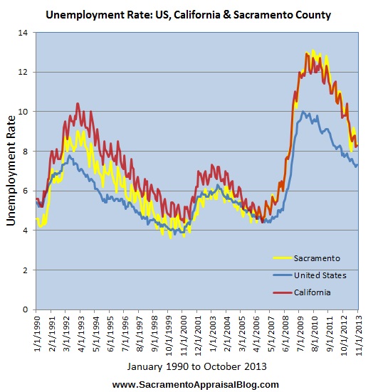
The Word on Jobs: Sacramento and California both saw an exponential increase in joblessness after the previous real estate “bubble” burst. Both the state and county since have been slowing getting back to levels more consistent with the rest of the nation.


Specifics on Jobs: Unemployment in Sacramento County has been declining since the summer of 2010. Currently the unemployment rate as of October 2013 is 8.4%. It’s still definitely not where we’d like it to be closer to 5%, but at least it’s not still 13% like it was, right? This graph pairs jobs with the median price. Jobs are a layer of value in the market that can impact the overall direction of values, but they are really only one layer. Ultimately the Sacramento real estate market will be healthier and stronger when the local economy improves and it’s easier to find good jobs. Bottom line.
Video of Trends: If you’d rather watch or listen to my interpretation of the market, check out the video above (or here). Feel free to share this video on your blog of social media too.
Share the Graphs: As always, you can use these images unaltered in your newsletter, on social media sites or blog posts (just link back). See my sharing policy for more details.
Question: Any thoughts, insight or stories to share? I’d love to hear your take.
If you liked this post, subscribe by email (or RSS). Thanks for being here.