Let me get straight to it. I’m excited to share some new visuals. I’m geeking out because these new images help tell a compelling story of seven years of price increases. Whether you’re local or not, I hope you can dig these.

A FEW QUICK THINGS THIS WEEK:
1) Loan Limits: You probably heard conforming loan limits were raised for the third year in a row. This basically helps buyers continue to afford higher prices. I’m not saying that’s bad, but it would be nice if wage growth more than anything was helping people afford the market.
2) Sign the Petition for Appraisers: Last week I wrote about a move to start getting rid of appraisers. This is a big deal with huge implications for the housing market and future escrows. I co-wrote a petition through change.org and I want to ask you to please sign it. SIGN HERE.
3) Cool Graphing Link: On a lighter note, Freddie Mac launched a new graphing tool where you can make quick visuals and even compare different markets throughout the United States. Not every city is listed, but it’s worth checking out and getting lost for a few minutes.
4) My Blue Kitchen: I talked about blue being the rage in kitchens, and I guess my post inspired me. During Thanksgiving break I built a new kitchen island and we painted it blue. Woodworking is definitely a passion and it’s something I do to help keep my sanity. Anyway, this was a fun project and I wanted to share.

SEVEN YEARS ON ONE GRAPH (NEW VISUALS):
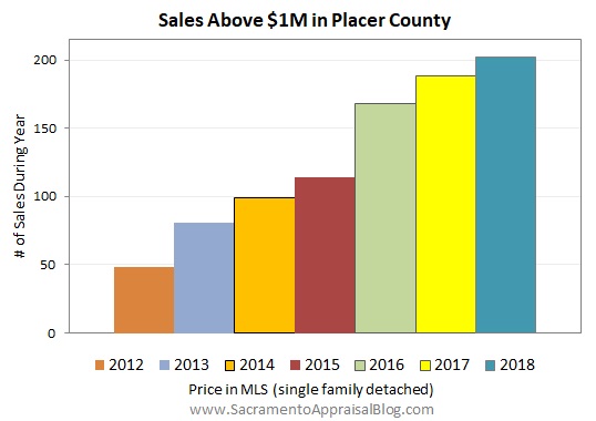
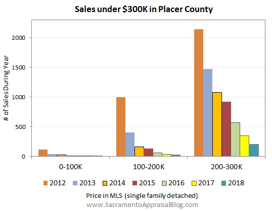
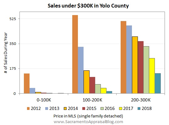
Here’s some images for four counties (Sacramento, Placer, Yolo, & El Dorado). What I like is we see price trends for seven years on one graph. It may take a moment to figure out how to digest these images, but look for changes in price and volume over time. So far people who have seen these have noted rising prices and definitely vanishing affordability. Keep in mind they don’t include most of December for 2018, and that could change the look slightly by next month.
What do you see?
SACRAMENTO COUNTY:


SACRAMENTO REGION:


PLACER COUNTY:


EL DORADO COUNTY:


YOLO COUNTY:


SHARE THESE IMAGES: You are welcome to share any of these images in your newsletter, on social media, or on your blog, etc… See my sharing policy for details and 5 ways to share (please don’t copy my post verbatim).
I hope that was interesting or helpful.
Questions: What do think of these images? Which ones do you like best? Any suggestions for improvement? I’d love to hear your take.
If you liked this post, subscribe by email (or RSS). Thanks for being here.
Hey Ryan! I love the blue kitchen cabinets! They are very cool! I also love your new visuals. The colors make it easy to read. I think that my favorite is the chart with the sales over $400K. Did you make those on Gnumeric?
Thanks Jamie. I appreciate it. I made them in Excel. I tend to use Gnumeric for neighborhood graphs and Excel for stuff that needs to look slightly more polished. These graphs can be made in any program of course. I also like the over $400K one (especially for Sac County). Amazing.
Thanks for letting me know. Very cool!
Interesting views Ryan. Makes the point how the market has shifted.
I also like the blue with the wood counter for your new island.
Thanks Joe. I remember sketching this out and planning for the island while at AppraiserFest. Thanks for the kind words.
Indeed. I’m loving this view. It’s one more way to see the market. For any onlookers, I made graphs like this for current listings too for Sacramento County. I didn’t post them here, but they’re located in a thread on my Facebook page. https://www.facebook.com/SacramentoAppraiser/posts/2172831162748545
Love the new graphs and all the information Ryan. I also like your island. Well done. Did you make the butcher block too?
Thanks Gary. I appreciate it. No, I bought the butcher block from a local company. I was considering making it, but I decided against it in light of needing to buy large clamps, get access to a massive planer, etc… In truth butcher block is so expensive (especially for walnut) that I maybe could have pulled this off for less with building myself. But some things are worth just buying…
Great information Ryan! And … your island looks amazing!
Thank you so much DeeDee. I appreciate it. While compiling this post I was actually thinking of you and a few others who ask me for more El Dorado County data. Glad to have made this. I was also thinking of Bay Area buyers when looking at the growth of million dollar sales…
Nice graphics! It is interesting that my markets are showing a 7 year peak as well. Also, thanks for sharing the new graphing feature from Freddie Mac! And I really like the blue in your kitchen!
Thanks Shannon. I appreciate the kind words. I was playing around with the price index and it’s fascinating to see Dallas vs Sacramento. Our market crash was cataclysmic, but Dallas looked much more subdued. Yet you’ve have huge price increases too in recent years (thanks in part to us Californians). Anyway, thanks for the comment.
Ryan, the numbers are not as drastic in my area and more ups and downs. You have the most amazing graphs. Mine never look as good as yours. Do you still use Gnumeric? I’m still working on the information your presented at Appraser Fest. Keep up the good work.
Thank you Mark. It is amazing how different locations can look so distinct.
I use Gnumeric every day for neighborhood graphs in my reports. I tend to use Excel for graphs that I want to look a little more polished. To me at least it seems Excel looks more refined, so I use Excel for most of the trend graphs I share on my blog. But otherwise I use Gnumeric for almost everything else. These types of graphs in this post could easily be done in Gnumeric of course.
Keep going strong Mark. Please reach out any time too if you have follow-up questions.
Great post, Ryan. I’m always interested in how your market compares to mine so I tried out the Freddie Mac graphing tool. There is a vast difference between Birmingham (Hoover) and Sacramento and I’m sharing it on Twitter. Thanks for sharing the link.
Thank you Tom. I appreciate it. Loved seeing that graph on Twitter too.