The housing market has turned the corner and we are seeing definitive slowing. Here are ten ways I’m seeing slowing in the market. If you’re not local, what are you seeing in your area?

NOT DULL: The market is slowing, but it’s not dull. It is still really competitive.
DOOM AND GLOOM: The doom and gloom crowd loves to say the market is starting to crash because of the slowness we’re seeing, but stats right now don’t support a crash and burn narrative. In my mind it’s premature to say the market has shifted directions. Of course if the stats go that way I’ll change my narrative. For now it’s most reasonable to say we are seeing what looks to be a normal seasonal slowing. Stay tuned.
 Glowing & slowing market update:
I’m doing a big market update for SAFE Credit Union next week. There is no cost. It’s totally free, but you have to register. It’ll be at 9am on Zoom on Wednesday August 18, 2021. It’ll be about an hour and packed with lots of stats and perspective. REGISTER HERE.
10 WAYS THE MARKET IS SLOWING
1) Prices are starting to dip: Last month we finally saw most price metrics take a dip from the previous month. The median price usually peaks around July, so this is what we would expect to see in a normal year.

2) We’re seeing fewer sales happen: Around this time of year we start to see sales volume slump. Here is one of my favorite images to help explain what I mean. The green line represents average monthly sales volume and we typically see the number of sales increase from January to June before dipping for the rest of the year. This is normal. The black line represents 2020 and it was such a freakishly abnormal year. Check out the red line though (2021). Volume peaked in June and it started to soften in July, which puts us right on track with normal historical averages. By the way, we had a thirteen month streak where monthly volume was up over the previous year, but that streak has been snapped. Last year we saw highly abnormal demand in July onward, which is why this year volume is actually down (even though it was a normal month in terms of numbers).

3) It’s taking longer to sell: Last month it took an extra day to sell in Sacramento County and two extra days in the region. Since August pendings in the region have taken sixteen days to get into contract, which is up two days from July sales. This is still lightning fast, but it’s clearly slower than it was a few months ago.

4) More homes are selling below the list price: There are slightly more homes selling at or below the list price right now. For two months in a row we’ve seen this metric increase and it’s a sign of a market that is slowing. Keep in mind in a normal market we should be seeing closer to half of all homes sell at or below the list price, so this market is still on steroids.

5) There are fewer offers above the list price: Here’s a visual to show what buyers are paying compared to the asking price. Most categories slowed slightly last month, but not every category. The most aggressive range in the market is 1-5%. Last month properties on average sold 3.7% above the original list price, which is still one of the highest percentages ever for the region, but it’s down 4.1% from the previous month. Keep in mind stats show we do not have an overpriced market, but sellers would be wise to note the clear change in temperature lately and price according to similar properties that are getting into contract instead of sensational headlines from a few months ago.

6) Housing supply has increased slightly: We are seeing an uptick in monthly housing supply. We are still at an absurdly low level with basically less than a one-month supply of homes for sale in most surrounding counties. In the region we have 0.92 months of supply, which means we basically have a month worth of listings before they run out. This number should be easily twice this amount.


7) More listings are hitting the market: We are definitely seeing more listings hit the market, but we are nowhere close to normal levels yet. About six months ago we had 1,200 or so listings on any given day and now we have over 2,000 listings. Granted, we should have about twice as many listings, but this is a step in the right direction. We typically start to see fewer new listings hit the market around this time of year, but one thing to watch is whether sellers pull back from listing their homes in light of the Delta variant. To be determined.

8) Smaller-sized homes are selling: If you didn’t know, when the spring market fades we typically start to see smaller homes sell, and that is exactly what has been happening for two months. The dark blue line represents the average home size in Sacramento and it goes up and down like clockwork each year. Do you see how size typically hits a seasonal peak during May or June (besides last year)? Anyway, the average size slumped in July quite a bit. This is actually something to watch because it can affect price stats. What I mean is whenever we interpret price stats we have to be in tune with what is actually selling.

9) Fewer multiple offers: For three months in a row we’ve seen fewer multiple offers in the Sacramento region. Keep in mind the percentage of offers is still about as high as it’s ever been.

10) Word on the street: I’m hearing from lots of real estate agents, loan officers, and appraisers that they’ve seen a slightly slower vibe. I haven’t heard many people call this market dull, but there is lots of chatter about slowing. At the same time I’m hearing things like, “My listing had 11 offers” or “We got outbid again,” which speaks to how competitive it is right now. Buyers, be hopeful that we’re seeing some seasonal slowing, but be careful not to think you’re poised for a big price discount. We’re just not in that sort of market.
Now more stats if that’s your thing.
——————– BIG MARKET UPDATE ——————–
JUNE TO JULY:
This is a helpful view to understand the market has been slowing. Take a look at how most metrics softened from June to July.


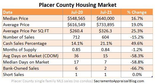
LAST YEAR VS THIS YEAR:
Last year the market was dull at the beginning of the pandemic, so this year versus last year gets a little weird for a comparison. My advice? Take these percentages with a grain of salt because they’re inflated due to sagging numbers last year. And remember these percentages DO NOT actually mean every house is worth that much more either.


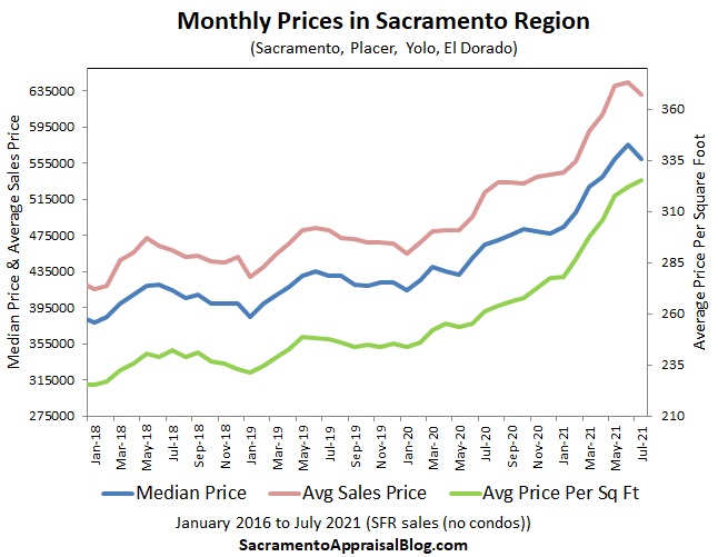
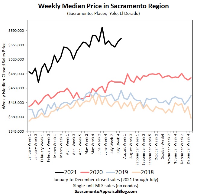
MORE PRICE VISUALS:
A few more visuals to show the insanity of price growth and softening lately. Look how far disconnected 2021 prices are from previous years.


Anyway, this is starting to get way too long.
MARKET STATS: I’ll have lots of market stats out this week on my social channels, so watch Twitter, Instagram, LinkedIn, and Facebook.
Thanks for being here.
SHARING POLICY: I welcome you to share some of these images on your social channels or in a newsletter. In case it helps, here are 6 ways to share my content (not copy verbatim). Thanks.
Questions: What are you seeing out there in the market? What are you hearing buyers and sellers say? I’d love to hear your take.
If you liked this post, subscribe by email (or RSS). Thanks for being here.
Hey Ryan, missed you last night. Once again asked Metrolist to increase the download record limit for mapped searches. We may see an after business hours accommodation to raise the limit to 5k.
Might be the difference between average PSF and sale price the change in average home size you mention. Never noticed that before but will definitely start looking.
That’s great news. It is such a drain only have 2,000. Fingers crossed. 5,000 would be great. Bingo on PSF. I’m watching that also. Thanks Joe.
Great post as always. We are seeing those same stats at our brokerage as well.
Thanks so much Jon. Keep me posted if you see anything out of the ordinary. I always appreciate the vantage point from real estate offices especially.
Thanks for you report Ryan! Well thought out and easily communicated for folks to understand. We really appreciate your expertise.
Michael
Thanks Michael. That’s a huge compliment. I appreciate it. Hey, see you at Starbucks soon…
So many great stats and sound analysis Ryan. Sacramento is lucky to have you.
Thanks so much Gary. I appreciate the kind words.
Hey Ryan, I have a request. When I see data like this on active listings, it’s usually discussed as an indicator of supply. But that’s really a measure of the interaction between supply and demand. Can you take a look at all listings placed on the market for the year, including those that sold or are currently pending? And compare to previous years? My hunch is that supply is trending about the same as previous years, but demand is so high that it has reduced *available* supply
Thanks Steve. I think you’re sniffing out one of the weaknesses of taking a snapshot of listings as of one day only. This is why I’ve essentially not been sharing this image for quite some time. Though this time around I thought it was interesting to finally see last year and this year more subdued on one image, so it was worth sharing. All that said, new listings are NOT back up to normal yet. I’ve written about this before and I’ll likely talk about it during coming market presentations. We are still off though. A quick way to see this is to pull up Trendgraphix and look at “pended/new listing” under the “For sale vs sold” category. New listings basically look more similar to last year (pandemic year), but they aren’t up to normal yet. But you’re right about demand reducing some of these listings. One of the issues with pulling a snapshot of listings is one of the reasons why we have less is due to more pendings that have essentially taken listings off the market.