Surprised. That’s how many people seem to feel about the housing market since it’s way more competitive than we thought it would be for a pandemic. In fact, some buyers think they’re about to score the deal of a century until they start shopping and realize we don’t have that sort of market right now.

Look, I’m not wearing rose-colored lenses. I’m not saying the housing market is perfectly healthy or there aren’t glaring red flags on the horizon. I’m just saying there is a sense of shock right now that the market has felt as strong as it has for these past two months.
Two quick things:
1) Imposing headlines: There are lots of sensational headlines, but we need to be cautious about imposing them on the market. What I mean it’s easy to read a headline about the housing market being doomed because of XYZ, and then we expect to see certain trends in the local market. My advice? Look to local data instead and let the numbers form your perception and narrative of the market.
2) Be objective: Every week there’s a new viral idea about the future, but we have to wait and see what happens. I know it drives some people crazy when I say that, but it’s true. There are obviously red flags about the future in light of forbearance and unemployment in particular, but we still don’t know how both issues are going to play out exactly. This is why I recommend knowing the numbers and being objective about the future instead of tossed around by every new sensational idea.
NEW MARKET VIDEO: We’re two months into the pandemic now and it’s been five weeks since the market bottomed out. We’ve seen a shift up in new listings and pending contracts, and this tells us both buyers and sellers have been getting used to this market. This is 14 minutes. Check it out below (or here).
BRAND NEW VISUALS:
I’ve been in my Excel workshop cutting up some brand new graphs. Are there any keepers?
Unemployment: We’re seeing some huge changes in unemployment, so I plan to update these visuals monthly.


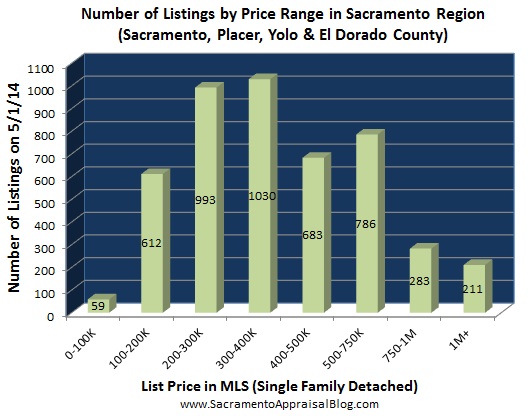
Inventory by price range: Here is a crazy-looking visual to show inventory by price range. I know this is a hot mess, but I share specific price ranges below. The point is inventory is not the same in every price range or neighborhood.

Days on market: Did you know homes spent 29% less time on the market this April compared to last April? Here’s a look at how long it took to sell by price range. In short, the market was more aggressive at lower prices (not a surprise). Also, don’t read too much into million dollar stats because there are fewer sales in this segment.

2-4 Units: I’ll be watching the multi-unit market to gauge change and whether we see a bigger drop in volume than the single family market. Of course we also have to consider rent control as an added layer that can affect the trends this year too.

Volume at the top: I’m watching the market above $600K to gauge if there is more change at the top than the bottom. In this visual I’m asking how the percentage of “jumbo” prices so to speak changes over time. This isn’t the perfect visual to tell us everything, but if we see this percentage decrease it might be a clue that less deals are happening at higher price points. Also, I know I need to change the graph to say “15%” instead of “0.15%”. For the life of me I couldn’t get that to work.

Volume change by price range: It’s important to study what the market is doing at various price points. I’ve been asked countless times about the upper end of the market lately. Frankly, we need more time. We only have two months of data. But here is a visual that I’ll be adding to over time. This visual basically gauges the change in the number of sales between April 2019 and April 2020 by price range.

Keep in mind the BOTTOM IS NOT CRASHING. The lowest prices saw a huge dip in volume close to 60%, but that’s because these price ranges had such a huge rate of appreciation over the past year. There are simply fewer sales under $300K this year, so the numbers at the bottom look really sensational on this graph. In short, this is where we have to know how to think through the numbers. Please don’t say the bottom is crashing (it’s not).
WEEKLY STATS: I’m updating this one every week.


BIG MONTHLY UPDATE:
This is long on purpose. Skim or digest slowly. Your call.
Let’s dive into Sacramento, Placer, and El Dorado County (and the region).
DOWNLOAD 100+ visuals: Please download all graphs here as a zip file. See my sharing policy for 5 ways to share (please don’t copy verbatim).
I don’t have market commentary this month because I’ve been giving so much commentary in my weekly video (and on Zoom calls). It’s just too much to write more here.
SACRAMENTO REGION (more graphs here):


SACRAMENTO COUNTY (more graphs here):


PLACER COUNTY (more graphs here):


EL DORADO COUNTY (more graphs here):


DOWNLOAD 100+ visuals: Please download all graphs here as a zip file. See my sharing policy for 5 ways to share (please don’t copy verbatim).
Questions: What stands out to you about the market right now? What are you seeing out there? I’d love to hear your take.
If you liked this post, subscribe by email (or RSS). Thanks for being here.

 Two ways to read the BIG POST:


